標誌設計理念
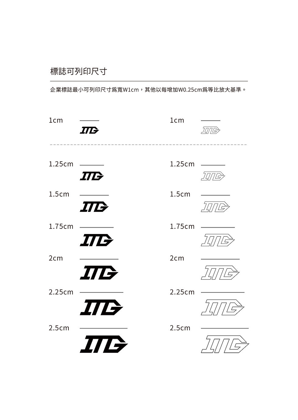
新鑫金屬有限公司,INTEGRAL BUILDING PRODUCTS INC.,簡稱ITG ,由二代近年新成立的分公司,以國外為主要客群,項目提供螺絲釘子的設計、製造及包裝一條龍服務;而新鑫的企業標誌我們傾向呈現的風貌能與國際公司快速接軌,令標誌能有高度辨識及直覺性,所以我們以經營項目-螺絲、釘子為基礎發想點,以歐美式風格為設計方向;我們利用簡單俐落的螺絲釘子外觀造型,結合企業的英文縮寫字母“ITG”,再將ITG整體向右傾斜20度,ITG三字母直豎筆劃作為螺絲的螺紋意象,G字是螺絲的尾端,整體標誌轉角處皆以俐落的尖角表現,以表達企業做事態度的精準與效率氛圍,若將整體畫面以順時鐘方向旋轉90度,可隱約呈現出螺絲釘的形狀;色系部分以黃帶點橘色,呼應公司名稱“鑫”字代表興旺、多金之意,顏色上自然會以黃色、金色為主要考量用色,再搭配灰色以代表金屬材質跟工業產業,給人精煉、明亮、活力及創新之感;而此設計希望呈現出“專業、創新、效率、精準、活力、彈性”的感受,簡顯易懂、但又不失穩重和內斂,有別於以往傳統產業給人生硬、古板、限制的刻板印象,展現出新一代經營的新思維。
Logo Concept
INTEGRAL BUILDING PRODUCTS INC., abbreviated as ITG, is a branch newly established by the second generation in recent years, with foreign customers as the main customer group. The project provides one-stop service of screw nail design, manufacturing and packaging; and Xinxin’s The corporate logo we tend to present can quickly integrate with international companies, making the logo highly recognizable and intuitive. Therefore, we base our ideas on business items-screws and nails, and take the European and American style as the design direction; we use simple The neat appearance of the screw nail is combined with the company’s English abbreviation "ITG", and the ITG is tilted 20 degrees to the right. The three-letter ITG vertical stroke is used as the thread image of the screw. The letter G is the end of the screw and the overall logo The corners are all expressed with sharp sharp corners to express the precise and efficient atmosphere of the company's attitude towards doing things. If the overall picture is rotated 90 degrees clockwise, the shape of a screw can be vaguely presented; the color part is yellow with a little orange The color echoes the company name "Xin" which means prosperity and gold. The color will naturally take yellow and gold as the main consideration color, and gray is used to represent the metal material and industrial industry, giving people refinement, brightness, vitality and A sense of innovation; and this design hopes to present a feeling of "professionalism, innovation, efficiency, precision, vitality, and flexibility", which is simple and easy to understand, yet stable and restrained, which is different from the traditional industries that have given life hard, old-fashioned, and restricted. The stereotype shows the new thinking of a new generation of management.


名片設計
材質:馬諦斯紙 深灰色300g、馬諦斯紙 黃橘色300g
加工:對錶、燙銀、燙黃疊色
Business Cards Design
Material/ Matt gray 300g,Matt yellow 300g
Processing/ Laminated 2 in 1,Hot foil stamping


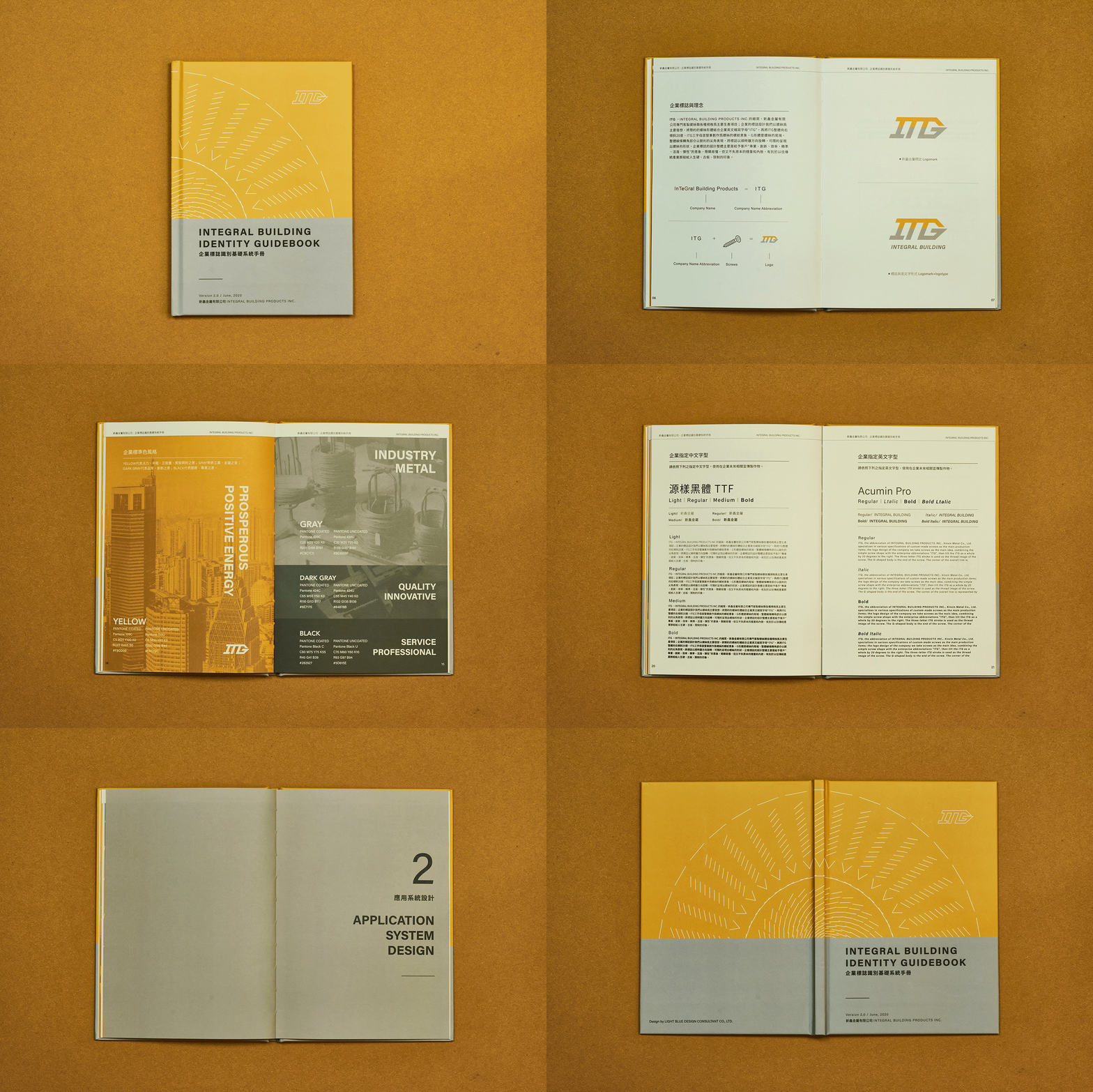
企業基礎系統識別設計手冊 IDENTITY GUIDEBOOK

未來週邊應用 Application


關係企業形象系列化設計從名片開始
Relationship corporate image series design, starting from business cards


Client
新鑫金屬有限公司ITG
Year
2020
Design
月白設計顧問有限公司 LBD
Photography
月白設計顧問有限公司 LBD
Service
企業標誌基礎識別系統設計 VI Design
名片設計 Business Card Design